I’m looking at some of the formal qualities of the GOAL! tiles, which are one of the materials I’m working with for Soccerthon88.
It’s interesting moving from the tiles that I used for Grotto and Didaktik Gama to tiles ripped from an NES game. In the previous two projects I had been building a very small palette of tiles that was really more of a characterset— based on early charactersets like PETSCII, ZX80, and CP438. These are charactersets that have both some kind of semantic meaning— they’re a set of both alphanumeric characters and box-drawing or shaded block characters that can be assembled on a grid to make image or maplike configutations. The NES doesn’t have a built in characterset that is stored in ROM. There are foreground sprites and background tilemaps, both of which are broken up into 8x8 pixel tiles. My previous tileset (which I was calling Libuše) had odd-sized tiles— 40x30 pixel tiles that I usually displayed at 20x15, so that on high-dpi displays like most Apple device displays, you could see some noise and detail that made them feel like pencil sketches, or something printed on paper. The wider-than-tall tiles retained some feeling from the Atari 2600, which had a higher vertical resolution than horizontal resolution.
Moving to a more modern square tile makes gives a little more “generic fake 8-bit” feeling (to me) but it does give me some additional possibilities. The first one that jumps to mind is the ability to rotate tiles. With wide tiles you can only flip individual tiles horizontally or vertically without breaking the grid. Square tiles can be rotated, which gives us the ability to do all sorts of attractive patchwork-quilt style patterns.
 So for this first experiment with the tiles, I used as many tilemap patterns as I could find, applied to this very large tileset that is every background and sprite tile I could scrape from GOAL!, which have very little semantic meaning or even coherance- there’s a few different pixel fonts, and so many pieces of artwork that I can’t imagine there was much reuse, just drawing things with pixels and then storing them as tiles. I did add some additional tiles to the Goal tiles, starting out with lower case and deseret alphabet characters, which I drew in order to make a regular ttf font.
The results are pretty? (press space to re-roll the pattern) I like these patterns. I like them too much maybe, they’re so much more harmonious than the stuff I’ve been doing in unity with the tiles. They give the wrong feeling. I think some more refinement is needed here. There’s the formal qualities that 8x8 tiles have, and then there’s stuff specific to GOAL!. There are so many tiles in GOAL! that to just use them randomly and rely on rotation for patterns gives us a huge variation with a lot of nice harmonious feelings that come solely from the rotation/patterns and color schemes I’m applying to them.
If I look closer at the specific tiles that GOAL! uses on the field— that is the tiles that express the additional visual rules beyond the ones that are arbitrarily coming from the way the NES stores and retrieves graphics— the perspective, we get some additional rules to play within that will refine our style.
GOAL! is drawn at a weird isometric angle:
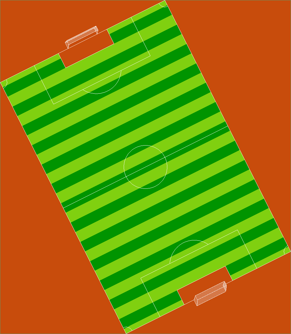 Let’s take an up close look at the way the horizontal and vertical vectors of the field are drawn:
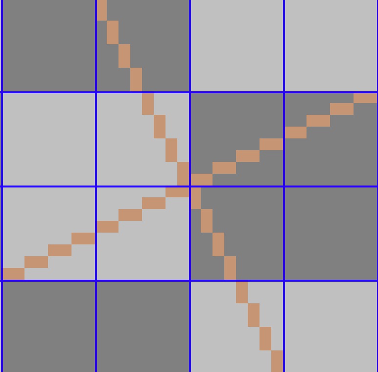
So you can see that while the NES imposes a visual chunk-size of 8x8 pixels, GOAL! is really thinking in 16x16 (16x8? 8x16?) pixel chunks. It’s vertical vectors are angled in a way where you have a diagonal sequence of 2 pixel high segments. The vector travels 8 pixels across every 16 pixels up or down. Likewise, horizontal vectors make it 8 pixels up or down every 16 pixels across. This gives us something to work with.
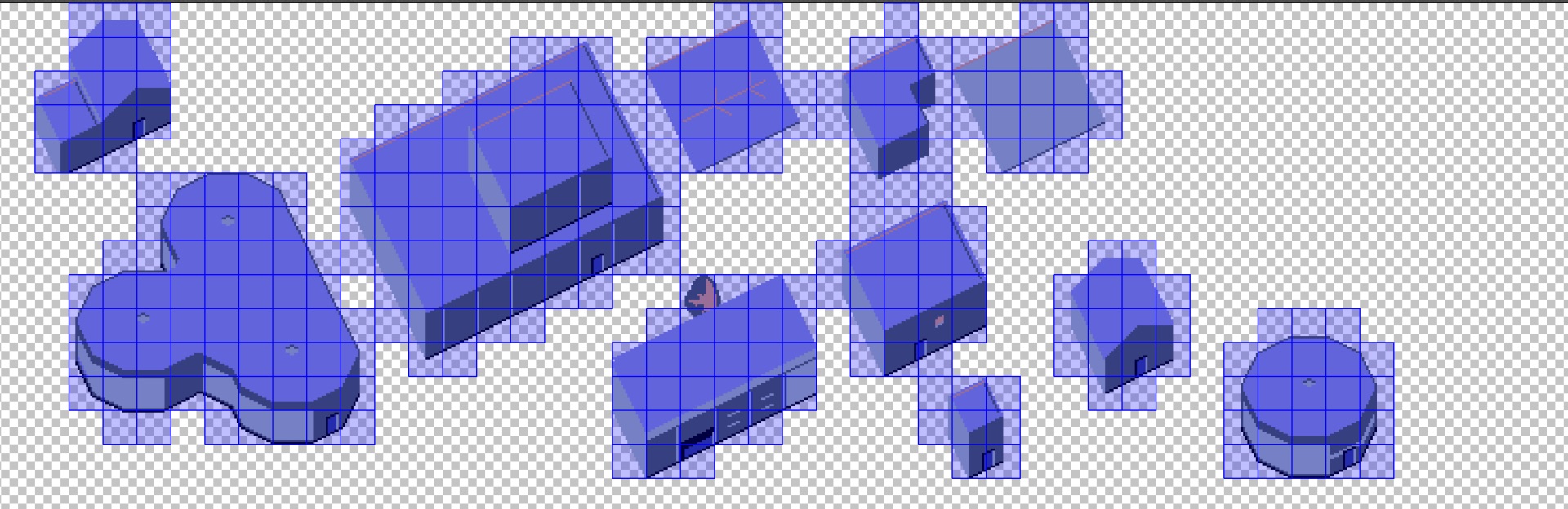
So while it’s difficult for me to invent images by combining and experimenting with a small number of tiles like I did in my previous two projects because there are too many damn tiles, I can pick out rules like this and use them to make new tiles, and use those in different configurations to make things that weren’t in GOAL!, such as buildings (in 16x16 tiles where lines should frequently meet in the same places on edges):
Anyway, my process right now is picking out little things like this to hold on to in order to have constraints and guidelines as I make new things or experiment, in order to build something that is visually cohesive and seems like its coming from somewhere that’s internally consistent. If this is done right it lets you suggest a lot of stuff without having to spell it out in customary gamer lore-dump exposition.
The next experiment will probably limit the tiles in the p5 sketch to a subset that adhere to the isometric angle rules, and to impose some more structure on the subtitle text I’ve been bringing into the sketch from the video transcription. This should give me some better idea of how to use these materials in the game itself, which is already a hairy experimental mess.